

TL;DR
I was one of two product designers on a one-month validation sprint for a leading Hong Kong F&B supplier's new wholesale ordering platform. We tested it in person with real Hong Kong store owners before the wider launch.
The platform had just been revamped so store owners could place orders themselves instead of going through the sales team. The real risk was whether a store owner placing their first order alone would get stuck and fall back to sales anyway. Over a month of 2–3 moderated sessions a day, testing gave a split answer:
- Store owners were confident (4.4/5) placing orders on their own.
- First-order task success was 100%, but 38.4% slower, because every user expected to choose the delivery location and date first.
My main scope was interface iteration. With the research findings, I reordered the flow around delivery and delivered two main enhancements: Suggested Items from order history, and in-app onboarding. The testing itself de-risked the launch.
Context
The sales team was tied up with store owners' order requests and accounting tasks.
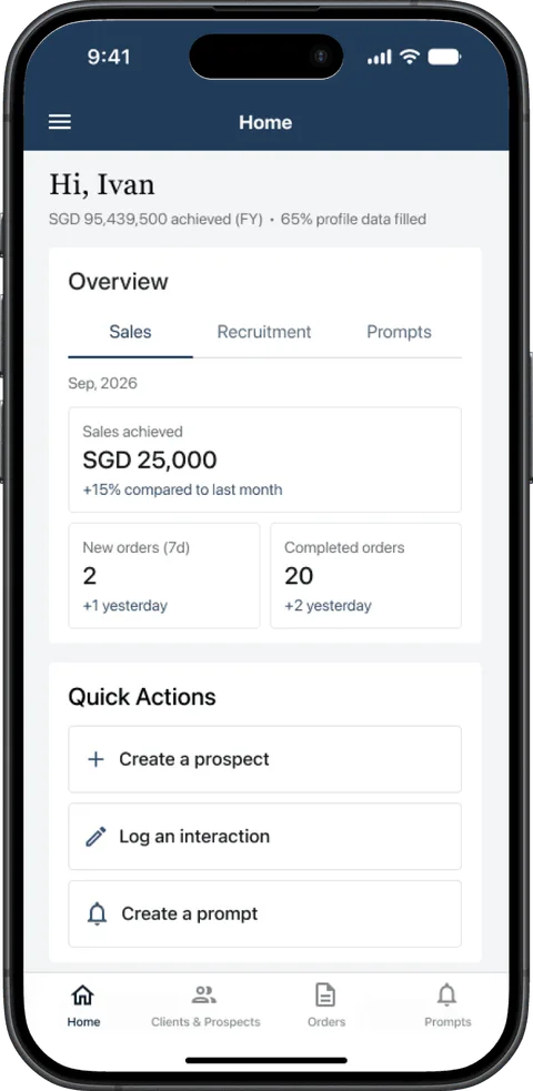
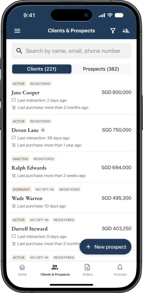
Store owners order ingredients such as bread on a regular cadence, but the old platform had small UI and a confusing display, so they kept asking the sales team to place orders. The old platform also wasn't integrated with the ERP system or warehouse management. With the growing workload, the sales team couldn't prospect or properly manage existing accounts.
Where the sales team's time went
Problem
The team had built for four months, yet no real store owner had used the platform before release.
The urgent need was to validate the new version with power users, which is why I joined the team.
The period of my engagementThe real risk was the first order: a store owner who got stuck alone would call sales, and the platform would add workload instead of removing it.
Research objective
Prove store owners could order on their own, and fix what stopped them.
The research had to produce two things:
- Evidence: can a store owner place an order confidently without the sales team?
- A refined interface: what should we adjust to make ordering easier?
Research approach
In-person sessions with real store owners overturned the flow's order: every user expected to pick delivery first.
In-person moderated sessions with store owners
We ran 2–3 moderated usability sessions a day, in person with real Hong Kong store owners: 9 owners and staff in charge of placing wholesale orders in total. The other product designer and I alternated moderating and note-taking. Store owners performed pre-defined tasks on the latest version of the web app.
Synthesis in Dovetail with shared tags and themes
We synthesised in Dovetail so both designers could work through the raw data with shared tags and themes and reach fact-based insights. We did this deliberately, to keep the team's confirmation bias out of the conclusions.
What we found:
- ✅ Users rated their confidence placing an order without the sales team at 4.4/5.
- ⚠️ First-order task success was 100%, and returning orders were 31% faster.
- ⚠️ First-time ordering took 38.4% longer, because of the expectation mismatch.
- ⚠️ "Order by box", "delivery location" and "cut-off time" weren't clear to store owners.
Solutions
The biggest change: re-ordering from the Quick Order page.
1. Place new orders on the same page
Research showed a mismatch with store owners' mental model. They didn't expect to re-order from the order history page: for anything to do with ordering, they always went to Quick Order.
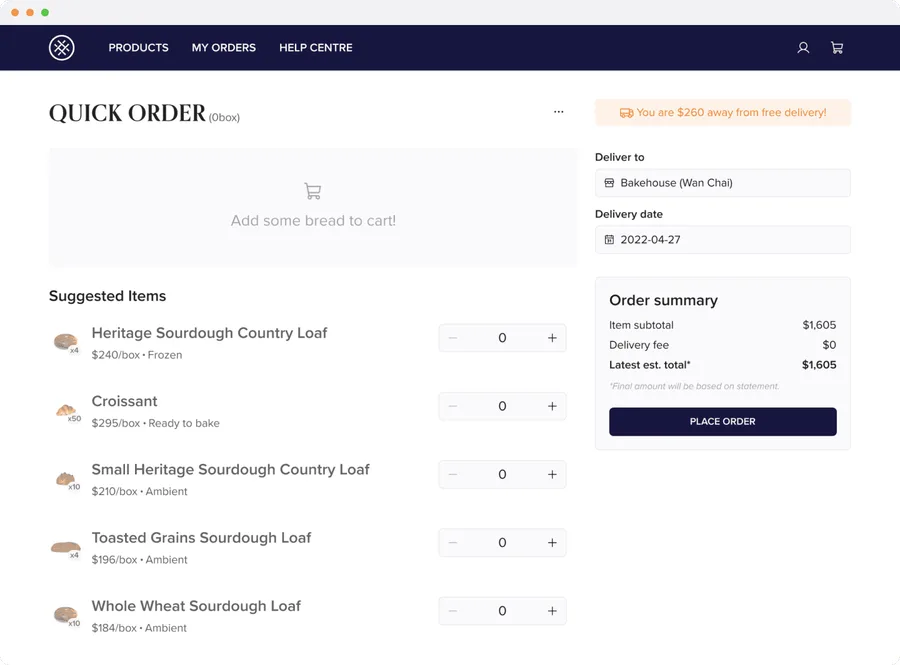
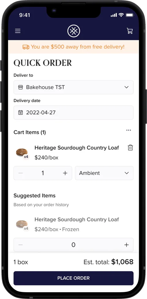
I moved the starting point for re-ordering from Order History to a new Quick Order page:
- Selecting the delivery location and date became the first step, as some users said: "If I don't choose the delivery date first, I would forget it."
- A Suggested Items section and Quick Add let users finish the order on the same screen.
This matched users' mental model and lowered their cognitive load: no more re-ordering from Order History or adding items through the product catalogue.
2. Suggest items from recent orders
Store owners wanted to see the items they order often while ordering, instead of adding them from the product catalogue.
I added the three most frequently ordered items as Suggested Items, with the option to see more from recent order history. Users find relevant items faster and can adjust quantities on the same page.
3. In-app onboarding to build confidence and reduce errors
The sales team used to answer lots of questions about "Order by box" and changing the delivery location for multi-store clients.
To reduce orders sent to the wrong store, a tooltip asks users to confirm the store first when they open Quick Order, which also matches their mental model. "How do I know when I'll receive the order?" was one of the questions store owners asked most, so the onboarding explains the cut-off time and the earliest delivery date.
Instead of hearing "Why did I select one item but it became six?", the onboarding tooltip explains the difference between normal ordering and "Order by box".
Impact
We removed the risk of store owners not using the new web app and made the launch smooth.
The research confirmed the new web app let store owners place orders on their own, freeing up the sales team's time for other work. Moving the delivery location and date to the start aligned the ordering flow with store owners' mental model and, with the onboarding enhancements, the new web app launched smoothly.
A store owner ordering on their own
- For users: they could complete orders with an easy, efficient ordering process.
- For Bread Elements: more efficient order handling and less sales-team time spent on enquiries, which indirectly brought more business value.
4.4/5
confidence placing orders without the sales team
100%
first-order task success in testing