


TL;DR
Overview - Designed and built a poll web app for Coca Cola's public event in Taipei and Kaohsiung, Taiwan
Worked as the sole product designer and full-stack (AI-assisted) developer on a critical-thinking poll web app for Swire Coca-Cola Taiwan's outdoor public-education event — run live across two weekends in Taipei and Kaohsiung.
The web app was the hinge of an offline-to-online journey: visitors learned a 3-step thinking framework at the booth, scanned one of nine topic QR codes, then practised on the app — judging which keyword in a statement was biased, voting, seeing how others answered, and redeeming a prize. Under huge one-shot social exposure (seeded KOLs, organic social, press), the app had one job and no second chance: make thousands of visitros actually practise and remember the framework.
It went well eventually. 100% uptime through the event, 4,000+ votes, and 91.3% of voters carried through to redeem. The event ran on the app without a hitch — and the client, a first-time client, flagged UX care beyond their expected scope.
ROLE
Product designer + full-stack developer (AI-assisted)
TIMELINE
Jul 2026 - Aug 2026
STAKEHOLDERS
Clients: Swire Coca-Cola Taiwan PR managers
Agency: a PR agency who owned booth and activity design
Context
Coca Cola planned to host a public education event promoting critical thinking in two cities in Taiwan
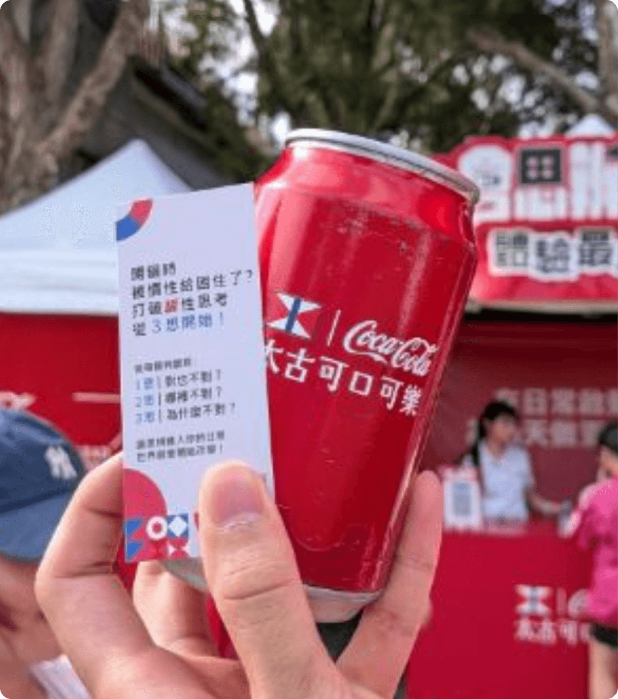
The event last for two weekends in two separate cities. Ensuring visitors learn about a 3-step thinking framework was the main objective of the whole event.

Image source: WoWoNews
The core 3-step thinking framework Coca Cola wants to promote:
Step 1: Yes, and No - Is the claim fair or biased?
Step 2: What's wrong - What wrong assumption does the statement have?
Step 3: Why is it wrong? - Why the assumption is wrong?
Role of the Web app
The web app was the hinge between the physical event and the online practice activity
It was the touchpoint that turned learning into practicing for visitors.

Meanwhile, the web app had to fulfill several operational objectives:
Have zero error under huge social exposure
Optimise for mobile users under outdoor environment
Be future-proof for future expansion
Event Journey
The event contained five major steps from learning to redeeming

Key objective to achieve
How to let visitors to practise, remember, and reflect the 3-step thinking framework and successfully redeem the prize afterwards?
Solutions
Three design solutions that address "practise", "remember" and "reflect"
One step per page or one page with three steps?
Exploration


Final
Paging away destroyed the context of the previous step. Therefore, I decided to go with the final version that preserves the context and emphasise 3-step framework.
Less disruptive or protect the outcome?
Exploration 1
Exploration 2
Originally, I prioritised the smooth flow as the criteria when designing this task. Exploration 1 used staggered animation with a short pause when the step title shows; exploration 2 used full-page text transition that emphasise a lot on the step title. Yet, I realised both sacrificed the most important objective of the event: Remember the framework.
Final
Eventually, I chose to implement tooltip that interrupts the flow but forces attention on the 3-step framework. It costs more reading time but I believe it is the best for the event outcome.
One button per keyword or one dedicated page?
Exploration


Final
I explored the layout with one button per keyword for explanation with the assumption of people only check the explanation of one keyword. Yet after some guerrilla testing, it turned out that people would like to see explanations of more than one keyword. That's why I decided to show explanation in a dedicated bottom sheet in the final version.

During exploration, I wanted to prototype different interaction along with different UI variation. With the existing components in codebase, I used Claude Code to visualise different explorations and to generate evaluation based on my own criteria. It didn't override my decision but more like a reference to expand my thinking scope.
In addition, accessibility was addressed for the outdoor environment
AA colour contrast and large touch targets for one-handed outdoor use; screen-reader navigation.
Loading optimised against slow public data via caching and a chosen CDN. (Scope the WCAG claim to what you actually verified — see landmines.)
Role of builder
My "Builder" role empowered me to solve problems from wider perspective — with a hard line where I don't trust AI
Before


After
Text truncation issue was the perfect example: During development, some words or punctuation marks were truncated unusually. AI proposed font-size-per-media-query. Yet I thought it would be better to do word/punctuation encapsulation rules (which tokens must break together) so the layout wraps meaningfully, not by character. And it aligns more with Mandarin Chinese practices.
Overall, I specified business logic, APIs, functions and design as much as I can, and left code implementation and automated tests to Claude. I was able to decide the caching mechanism with trade-off for faster page and less drop-off. Extreme cases such as concurrent voting load pressure and bot-like traffic were addressed as well.
IMPACT
The web app not just live across two cities, but visitors engaged, and it never fell over.
The event was completed smoothly. Clients were satisfied with overall works.
100%
uptime during the event
91.3%
vote-to-redeem conversion
4,000+ votes
across both weekends